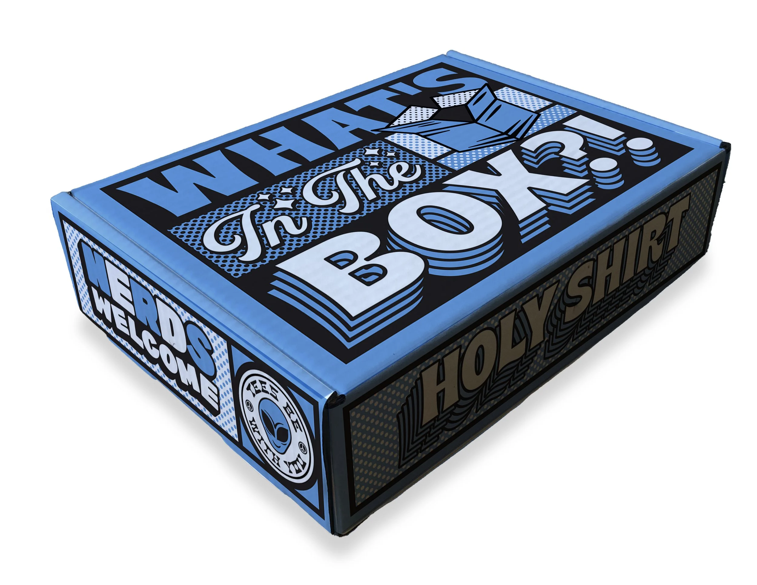
TeePublic Packaging: The Box
About
In early 2021, with the goal of increasing the annual rate of purchase, TeePublic attempted a series of experiments specifically targeted at the post purchase experience for first time customers.
One of these experiments included a higher quality, highly branded unboxing experience.
The Outcome
With a pop-culture referencing concept established (and if you don’t catch the reference, it still works), the TeePublic design team was a little too lean to take this project on its own. We hired one of our favorite studios to help us out, Brethren Design Co. They brilliantly translated the idea into illustrations that speak to TeePublic’s diverse but nerdy audience, while remaining irreverently funny.


Tees that Pop
Brethren brought our concept to life through cheeky pop art illustrations based on data we provided of the marketplace’s top-selling categories including horror, science, and of course, cats.


Nerds Welcome
Inclusivity is a core tenet at TeePublic. We wanted the packaging design to reflect a warm, welcoming vibe where you know you’re going to have a good time whether you like aliens, cats or alien-cats.


